
Cosine Plot with Matplotlib Assignment Answers
Your question:
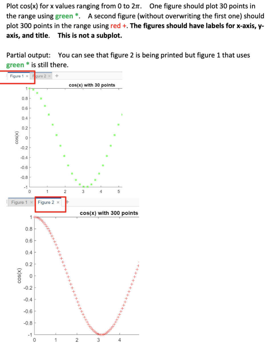
Plot cos(x) for x values ranging from 0 to 2π. One figure should plot 30 points in the range using green *. A second figure (without overwriting the first one) should plot 300 points in the range using red + . The figures should have labels for x-axis, y axis, and title. This is not a subplot. Partial output: You can see that figure 2 is being printed but figure 1 that uses green ∗ is still there.
Assignment Help Answers with Step-by-Step Explanation:
It appears that you're requesting a Python script using a library like Matplotlib to plot the cosine function with specific requirements. Below is a simple example using Matplotlib to achieve the specified plot:
x2 = np.linspace(0, 2 * np.pi, 300)
# Generate y values for cos(x)
plt.xlabel('X-axis')
plt.ylabel('Y-axis')
# Plot the second figure with red '+' for 300 points
plt.figure()
plt.show()
()
- `numpy` is used for numerical operations.
- `matplotlib.pyplot` is used for plotting.
- `y = np.cos(x1)` and `y = np.cos(x2)` calculate the cosine of each x value for the respective figures.
4. Plotting the first figure:
5. Plotting the second figure:
- Another figure is created using `plt.figure()` to avoid overwriting the first one.