
STAT20029 Module 3: Numerical descriptive measures
Module 3: Numerical descriptive measures
Introduction
Although pictures are very important, there are still times when they don’t tell us all we need to know about a data set. We should almost always use both graphical and numerical summaries to explore a data set before we even think about more complex analyses, but often these tell us all we need to know about the data and there is no need to look deeper.
This week we explore various measures of the central tendency (describing where the ‘middle’ of the data set is), measures of dispersion (are the data values similar to each other or spread out?) and measures of correlation between variables (for example, do high values of one variable correspond to high values in another variable?).
Remember that you’ll need to know how to do these calculations by hand as well as using Excel.
Objectives
On completion of this module you should be able to:
- calculate and interpret measures of central tendency (mean, median & mode) for samples and populations
- calculate and interpret quartiles, range, interquartile range, variance and standard deviation
- calculate and interpret the coefficient of variation
- understand and utilise the Chebyshev’s Rule
- construct a box-and-whisker plot
- calculate covariance and correlation and
- discuss pitfalls and ethical issues relating to descriptive measures.
Readings
Source
Some students may find portions of Appendices A, B and C from optional reading source as useful reading when you have difficulty understanding the concepts, and if you have access to the book or can borrow it from the library.
Measures of central tendency
Often when we look at a data set, we want to know what a typical result is or get a single value from the data that we may consider as the most representative. We will look at three different ways of measuring the typical value: mean, median and mode.
Mean
When people talk about the average, they are referring to the mean (sometimes referred to as the arithmetic mean). All data values contribute to this measure, but this also means that the mean is greatly affected by any large data values. When a sample data set is used, the sample mean is found via: X̄=(∑(i=1)^nXi )/n
where the term X̄(read as ‘X bar’) is used to indicate the sample mean ∑(i=1)^nXi , is the sum of all the data values (the values) and n is the sample size.
If the data is available for the entire population, the population mean is found via: μ=(∑(i=1)^NXi )/N
where the term μ (Greek letter ‘mu’) is used to indicate the population mean ∑(i=1)^NXi , is the sum of all the data values (Xi the values, the first observation is Xi, the second is X2, etc. The upper case Greek letter sigma “∑” usually always means add all the values), and N is the population size.
Note: population parameters are always denoted by Greek letters (for example μ, σ, p) and sample values by Roman letters (, S and p).
Median
The median is the middle value of the data set where the data has been sorted from smallest to largest (called an array, but an array can also be from the largest to the smallest). This means that half of the data are less than or equal to the median and half of the data are greater than or equal to the median. Unlike the mean, the median is not affected by extreme data values. The median is found via:
Median ranked value
Mode
The mode is the data value that occurs most often. It is possible that a data set has no mode, each value occurs only once. Unlike previous measures of central tendency, mode can exist for data which are not numerical and there can be more than one mode for a data set. Mode is the only measure of central tendency for categorical data.
|
Example 3–1 A manufacturer of mobile phones has been concerned that the latest model of the battery is not lasting as long as anticipated. They take a random sample of 20 phones and batteries, and record how long they take to go flat (this is done by turning the phones on and leaving them switched on until the battery goes flat). The following data (battery life in hours) are the result:
Calculate the mean, median and mode of the battery lives. Which measures of the battery life do you think are best and worst for this data? Why? How will this information be of use to the manufacturer? |
The geometric mean
The geometric mean measures the central tendency by multiplicative method rather than additive method. It is found via:
X̄G=(X1×X2×…×Xn )^(1/n)
Note: whenever the word ‘mean’ is used alone it refers to the arithmetic mean. The geometric mean is always distinguished from the arithmetic mean by including the word ‘geometric’.
The geometric mean rate of return gives the average percentage return of an investment over time. It is found via:
R̄G=[(1+R1 )×(1+R2 )×…×(1+Rn )]^(1/n)-1
When you use “simple interest”, arithmetic mean is appropriate, but when you use “compound interest”, geometric mean is appropriate.
|
Example 3–2 The total rate of return (%) of three blue-chip stocks is given in the table below for the years 2003, 2004 and 2005.
a) Calculate the geometric mean rate of return for each stock. b) Compare these results. |
Approximating the mean for a frequency distribution
If instead of raw data, you have a frequency distribution, it is not always possible to calculate the arithmetic mean. It is, however, possible to approximate the mean using the following formula:
X̄=(∑(j=1)^c〖mj fj 〗)/n
where c is the number of classes in the frequency distribution, mj is the midpoint of the jth class and fj is the frequency of the jth class. Example 3–4 (see later) demonstrates the calculation of the approximate mean.
Quartiles
Quartiles divide the (ordered) data into four subgroups. The three quartiles are often referred to as Q1, Q2 and Q3. The second quartile, Q2, is the median of the data. It separates the smallest half of the data from the largest half. The first quartile, Q1, is often called the lower quartile (abbreviated to LQ). It separates the smallest quarter of the data from the largest three quarters. The third quartile, Q3, is often called the upper quartile (UQ). It separates the smallest three quarters of the data from the largest quarter. When data is ordered from smallest to largest, the lower and upper quartiles are found via the following:
Lower quartile =(n+1)/4 ranked value
Upper quartile =3(n+1)/4 ranked value
Depending on the sample size (n), the ranked value found using these formulae may not be a nice whole number. For example, if , then we would be looking for the (14+1)/4=3.75th and 3(14+1)/4=11.25th values. There are three methods commonly used for dealing with this problem:
- Round the ranked value to the nearest whole number. For n=14, we would then look for the 4th and 11th values for the lower and upper quartiles respectively.
- Find the value half way between two data points. For n=14, we would take the lower quartile as the value 0.5 of the way from the 3rd ranked value to the 4th ranked value and the upper quartile as the value 0.5 of the way from the 11th to 12th ranked values.
- Find the value as the appropriate fraction of the way between two data points. For n=14, we would take the lower quartile as the value 0.75 of the way from the 3rd ranked value to the 4th ranked value and the upper quartile as the value 0.25 of the way from the 11th to 12th ranked values.
Of these three methods, the third is preferred. We will demonstrate how to find these quartiles in Example 3–3.
Quartiles are coarser dissection of a data set than percentiles, percentiles are more general. The lower quartile is the 25th percentile (since 25% of the data values are less than or equal to this value), the median is the 50th percentile and the upper quartile is the 75th percentile. Using this terminology it also makes sense to discuss other percentile values (e.g., the 90th percentile, the 5th percentile, etc.). The formula for the pth percentile value is:
(p+1)/100 ranked value.
Measures of dispersion
Range
The range is the difference between the largest and the smallest data values:
Range=Xlargest -Xsmallest
Range is a poor measure of the spread of data because it only considers two observations. Ideally, a good statistic should include all observations in the metric.
Interquartile range
The interquartile range is the difference between the upper and lower quartiles:
QR=UQ-LQ=Q3-Q1
Variance and standard deviation
The variance and the standard deviation are measures of the variability in the data. Unlike the range and interquartile range, they take into account all the data values. Variance and standard deviation measure ‘average’ dispersion of data around the mean. The variance finds the average of squared differences of the data values from the mean. Because of this, its value is always nonnegative. If the value was zero, this would indicate that there is no variation in the data (all the data values would be identical). We square the differences to avoid the negative signs, otherwise the negative differences from the mean will cancel out the positive differences. An alternative to the standard deviation is MAD (mean absolute deviation) where we take absolute values, but it is less popular because of the difficulty of mathematical operations with the absolute operand.
The sample variance is given by
S2=(∑(i=1)n(Xi-X̄)2 )/(n-1)
and the population variance by
σ2=(∑i=1N(Xi-μ)2 )/N.
The standard deviation is the square root of the variance and so is given by
S=√((∑(i=1)n(Xi-X-̄)2 )/(n-1))
and
σ=√((∑(i=1)N(Xi-μ)2 )/N)
for sample and population, respectively.
A better computational formula for the variance and standard deviation
Although the text uses the formulae above, these are computationally more intensive, and for that reason, often avoided. For hand calculations the formulae below are an easier way to find the variance and standard deviation. Statistics mode on a calculator will quickly offer the ∑X and ∑X2 values, and these can then be substituted into the formula to give the variance.
The sample variance is found via:
S2=(∑X2 -(∑X)2/n)/(n-1)
and the sample standard deviation is found via:
S=√((∑X2 -(∑X)2/n)/(n-1))
The population variance is found via:
σ2=(∑X2 -(∑X)2/N)/N
and the population standard deviation is found via:
σ=√((∑X2 -(∑X)2/N)/N)
The variance is expressed in terms of squared units of measurement. For example, with the data in Example 3–1, the variance is expressed in terms of squared hours of battery life. This makes it very difficult to interpret. The standard deviation, on the other hand, is expressed in the same units as the original data. In Example 3–1, this means it is expressed in terms of battery hours. When we discuss the empirical rule and Chebyshev’s rule (see below) we will talk more about interpreting standard deviations.
Important: Note the use of n-1 in the denominator in the formula for the sample, which does not happen for the population. This is due to loss in degrees of freedom. We have lost one degree of freedom by using X̅ in the formula. To illustrate, consider three values, 2, 5, 8, whose mean is 5. Suppose we know the first two values and do not know the third value, but we know the mean is 5. In that case, we can easily find the third value to be 8. Thus, the last value of the data has become redundant and, we have lost one degree of freedom. The problem does not arise with the population because we have the whole information.
Coefficient of variation
The standard deviation’s size is dependent on the kind of variable being measured. This makes comparisons difficult. We couldn’t say, for example, that for the data measuring battery life (in Example 3–1), a standard deviation of 8 hours, indicates greater variability than a standard deviation of 4 kilograms for body weights in a sample of 20 people. One way of comparing variability between data sets which use different measurement units, or that have different magnitudes, is via the coefficient of variation.
The coefficient of variation measures the ratio of the standard deviation to the mean, expressing this as a percentage. Since this is a relative comparison of the standard deviation to its mean, it therefore takes account of the type and relative size of values in the data being compared. It is always expressed as a percentage, rather than in the units of the data.
The sample coefficient of variation is found via:
CV=(S/X̄ )×100%
and the population coefficient of variation is found via:
CV=(σ/μ)×100%
Using the coefficient of variation, we could say that a value of indicates much more variability than a value of .
|
Example 3–3 Returning to the data set from Example 3–1, compute the variance, standard deviation, coefficient of variation, lower and upper quartiles, interquartile range and range. |
Variance and standard deviation for a frequency distribution
The approximate standard deviation of a frequency distribution is
S=√((∑(j=1)c〖(mj-X̄ )2 fj 〗)/(n-1))
Alternative computational formula for variance of frequency data
As we saw for the earlier variance formulae, it is possible to use an easier computational formula for the sample variance of frequency distributions:
S2=(∑〖m2 f〗-(∑mf)2/n)/(n-1)
As before, the sample standard deviation is the square root of the sample variance:
S=√(S2 )=√((∑〖m2 f〗-(∑mf)2/n)/(n-1))
|
Example 3–4 Participants at a recent accounting for small businesses workshop were asked to complete an anonymous survey. The table below contains data taken from this survey: a frequency distribution of the number of staff employed by each of the 50 small businesses in attendance at the workshop. Note that fractional (part-time) staff were recorded in this survey, so for example 2.75 staff could mean two full time and one staff member employed for ¾ of the hours in a working week. Approximate the arithmetic mean and standard deviation of the number of attendees.
|
Distribution shape
Box-and-whisker plots (Boxplots)
A five-number summary is a list of the following values:
- minimum
- lower quartile
- median
- upper quartile
- maximum
These values give useful information about the way the data is distributed. A box-and-whisker plot (or boxplot) is a visual presentation of the five-number summary (see the example that follows). A box is used to enclose the median. The box extends down to the lower quartile and up to the upper quartile. Therefore, we know that 50% of the data falls within the central box. Tails then extend from the edges of this box out to the minimum and maximum values.
For example, the five-number summary below gives customer numbers per day at a small financial advice business. The box-and-whisker plot follows. The central box extends from 20 to 40 (the lower and upper quartiles) with a vertical line at 30 (the median). Tails (or whiskers) extend from the box to the minimum and maximum values.
|
Box-and-whisker plot of customer numbers per day | |
|
Five-number Summary | |
|
Minimum |
10 |
|
First Quartile |
20 |
|
Median |
30 |
|
Third Quartile |
40 |
|
Maximum |
50 |
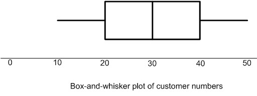
Excel/KaddStat will also produce box-and-whisker plots of several data sets on the same axes. This allows easy comparisons of the shape of the distributions.
Some statisticians recommend that each whisker be extended to a maximum length of 1.5 times of IQR. Values farther away are to be noted as outliers. This makes sense, otherwise the box could be really small.
Shape of a distribution
The shape of a data distribution most often is shown as a line curve where x-axis gives the values and y-axis the frequency (number of occurrences). You can understand the shape of a data distribution if you visualize the range of values is drawn on a horizontal scale. Each value on this horizontal scale has a column. Consider each observation to be a ball. Put each ball in the column corresponding to the value for an observation. At the end you will find stacked columns of balls. Imagine a line touching the top ball of each column. That line describes the distribution of data. Obviously, the line will be highest where most values occur.
To illustrate, consider the accompanying data set:
2, 3, 3, 4, 4, 4, 5, 5, 5, 5, 6, 6, 6, 7, 7, and 8
The distribution for this data would look as follows (a triangular shape):
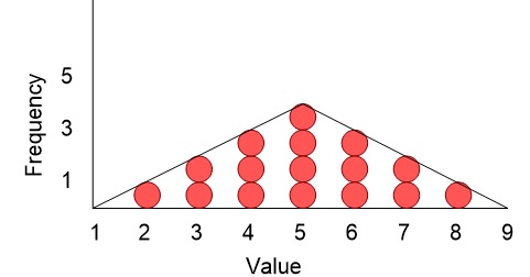
Skewness occurs when a distribution lacks symmetry. We describe the distribution as either positively skewed (skewed to the right) or negatively skewed (skewed to the left) or as symmetrical.
The following diagrams illustrate the kind of distribution that might be expected in each of these three cases. When a distribution is negatively skewed (also called skewed to the left), the mean is less than the median. The skewed portion is indicated by the long, thin part of the curve to the left. When a distribution is positively skewed (also called skewed to the right), the mean is greater than the median. When the distribution is symmetrical, the mean will equal (or be very close to) the median.
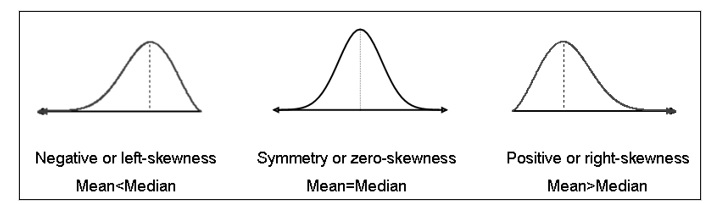
The box-and-whisker plot can also indicate where skewness exists. The example given above was symmetrical and so revealed no skewness. The upper and lower quartiles were equal distances away from the median, and the minimum and maximum values were also equal distances away from the median. A box-and-whisker plot with negative skew would have a longer whisker towards the minimum than towards the maximum (indicating the outer values are skewed), and the median would be closer to the right side of the box (indicating the middle 50% of values are skewed). The reverse would be true for a positively skewed distribution.
Skewness Coefficient:
For sample sk=(3(X̅-Md))/S;, ; for population sk=(3(μ-Md))/σ , where Md is mode.
The characteristics of the distribution of data are usually captured by moments; the first moment is mean, the second moment is standard deviation, the third moment is skewness, the fourth moment is kurtosis, and so on.
|
Example 3–5 Returning to the data set in Example 3–1 again, a) Construct a box-and-whisker plot. b) If the manufacturer intended to issue a statement saying that their batteries will last more than 50 hours, what would you advise them? Why? c) Suppose the first value was 142 instead of 42. Repeat (a) above and comment on the differences. d) Repeat the analysis of Examples 3–1, 3–2 and Example 3–3 (parts (a) and (b)) with the new data value. Comment on the differences. e) How would you describe the shape of the original data set? The revised data set? |
Chebyshev’s Rule
Chebyshev’s Rule (or the Bienaymé-Chebyshev Rule) applies to any data distribution, regardless of shape. It can therefore be used whether the distribution of the data is known or unknown. When appropriate (i.e., when data is known to have a particular type of distribution), it is preferable to use the characteristics of that distribution because Chebyshev’s rule gives the most conservative estimates.
Chebyshev’s Rule states:
A proportion of at least 1-1/k2 data values are within k standard deviations of the mean (μ±kσ)..
|
Example 3–6 Returning to the original data set in Example 3–1 above, answer the following questions. (a) According to Chebyshev’s Rule, what percentage of these battery lives are expected to be within standard deviation of the mean? Within standard deviations of the mean? Within standard deviations of the mean? (b) Assume that the manufacturer knows that the mean life of the population of batteries is 48.2 hours and the standard deviation of the population of batteries is 3.1 hours. What percentage of data values are actually within standard deviation of the mean? Within standard deviations of the mean? Within standard deviations of the mean? (c) Discuss the differences in your answers to (a) and (b). |
Z-scores
A z-score is the standardised value of a data point. If the distributions of two different variables are to be compared, it can be done after determining their z-scores. For example, if we wish to compare the distribution of weights of apples with the pace with which a normal human beings heart beats, it can be done after determining the z-score of each observation.
For sample data, z=(X-X̅)/S; for population data, z=(X-μ)/σ
Correlation and covariance
Correlation and covariance are two measures of the strength of a relationship between two numerical variables. The first step in determining whether any relationship exists, however, is always to produce a scatterplot which will give a visual indication of any relationship.
Covariance
Covariance measures the strength of the linear relationship between two numerical variables. The sample covariance is defined by:
cov(X,Y)=(∑(i=1)n(Xi-X̄ )(Yi-Ȳ ) )/(n-1)
The size of the covariance is related to the variable being measured rather than the relative strength of the relationship. A covariance of 10, for example, tells us only that the relationship between the two variables is positive. It does not tell us how strong the relationship is, nor does it necessarily enable us to say that this reveals a stronger relationship than a covariance of 5. The correlation coefficient overcomes this problem.
Correlation
The correlation coefficient measures the relative strength of a linear relationship. A value of indicates perfect negative correlation, a value of 0 indicates no relationship exists and a value of indicates a perfect positive relationship. The symbol r (Greek letter ‘rho’) is used for population correlation and r is used to represent sample correlation.
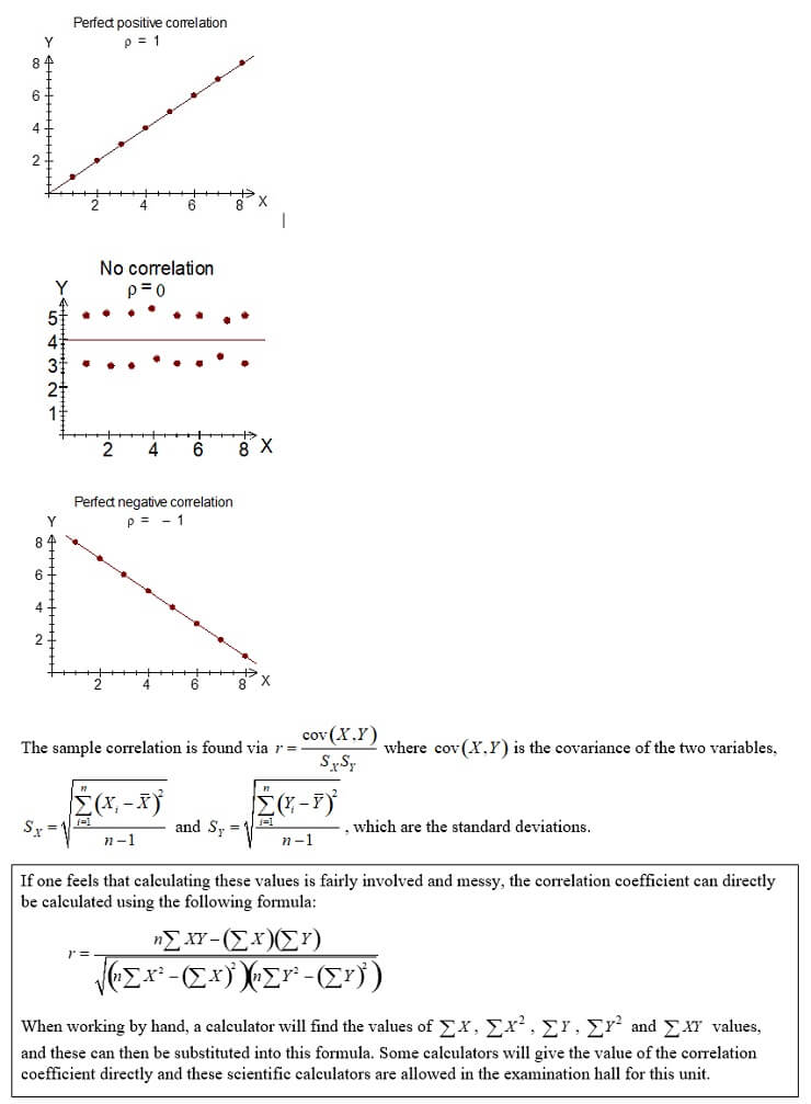
The sample correlation is found via where is the covariance of the two variables, and , which are the standard deviations.
|
If one feels that calculating these values is fairly involved and messy, the correlation coefficient can directly be calculated using the following formula: When working by hand, a calculator will find the values of , , , and values, and these can then be substituted into this formula. Some calculators will give the value of the correlation coefficient directly and these scientific calculators are allowed in the examination hall for this unit. |
Care needs to be taken when interpreting correlation. Just because two variables have strong correlation does not imply that one causes the other. Correlation could be caused by chance, by a third (perhaps unknown) variable, or by cause-and-effect. Further investigation would be necessary to determine which of these is appropriate in any given scenario. But, if causation does exist, this does imply that there will be correlation (but not necessarily vice versa). Due to errors in observations, we can never expect a zero correlation even if the two variables are uncorrelated in the real world.
There are other types of correlation coefficients, and therefore, not to be confused, the above correlation coefficient is often referred to as Pearson’s Correlation Coefficient.
|
Example 3–7 A real estate agency is worried that many of their agents are using poor sales techniques and that this is having a negative impact on sales. They believe this is because many of their agents received very low scores on their compulsory training course exam (an exam which is sat prior to beginning employment with the agency). They randomly select 10 of their agents, recording their exam scores (out of 200) and the number of sales they made in the year 2015. This data is recorded in the following table:
(a) Produce a scatterplot of the data. Does there appear to be any correlation between exam score and sales? Explain. (b) Compute the correlation coefficient. Comment on this value and its meaning for the real estate agency. |
Ethical issues
There is a fair degree of scepticism evident in the community when it comes to statistics. Many times this is due to experiences with someone misquoting or misusing the statistical results. Since statistics is the mathematics of uncertainty, the results are uncertain at least to some degree. It is therefore very important to analyse and report data in a fair and ethical manner. The following are some guidelines and comments that may be helpful in doing so:
- Report results accurately but in a neutral and objective manner. As well as doing and reporting the statistical calculations, explain in simple words for a layperson – this always requires prose to explain/discuss/interpret results in the context of the problem.
- Choose the most appropriate numerical descriptive measures for a particular data set. Knowing the shape of the distribution can also influence the choice of descriptive measures that you use. For example, the centre of a highly skewed data set might be better described by the median rather than the mean.
- Interpretation of numerical values is subjective (although the actual calculations are objective). Care must be taken to distinguish interpretive comments (even those made by experts) from factual information.
- Poor presentation is not necessarily the same as unethical presentation of results. Unethical behaviour occurs when:
- an inappropriate summary method is chosen wilfully or
- when some results or analyses are not reported because it would not support a particular position or favoured theory. It is therefore particularly important to report both good and bad results.
Discussion points
|
Discussion point 3–1 In your Black et al. textbook on page 104 problem 3.9, look carefully at the table. If possible, get more information about Australian banks from the internet. Form your views. Compare your views or conclusions to what others in your class propose. |
Summary
Now that you have completed this module, turn back to the objectives at the beginning of the module. Have you achieved these objectives?
Ensure that you attempt the recommended problems in the list of review questions below and at least a sample of problems from the optional list. This will help you to identify any areas of difficulty you have in achieving the module’s objectives.
Review questions
|
Recommended problems Black et al. Business Analytics and Statistics: Problems 3.1 and 3.4 on page 66, 3.5 on page 71, 3.8 on page 85, 3.3 on page 103. Problem 3–1: Additional frequency distribution problem
A real estate specialises in selling small businesses. The following frequency distribution is taken from a random sample of 50 businesses which have been listed with the agency recently. Approximate the arithmetic mean and standard deviation of the value of the businesses listed with the agency. Solution 3–1 = $150,000; S = $165,137.53 Optional problems Black et al. Business Analytics and Statistics: Review Problems 3.1, 3.4, 3.8 on page 103. |
Tutorial and Workshop
|
Workshop Watch the following video on how to draw multiple graphs in Excel: https://www.youtube.com/watch?v=8Qv-QssslhM Watch the following video on how to create a boxplot in Excel (Note: Quartiles in Excel may not be exact, you may therefore have to type in the values instead of using the quartile function): https://www.youtube.com/watch?v=DNpvSg2X0xQ Also for multiple boxplots, watch https://www.youtube.com/watch?v=cqNcGvN8Nak After watching the videos practice doing it yourself. Tutorial Solve the recommended problems under Review questions. |
